Understanding the day-to-day health of your K-12 food service operation is essential to ensuring its success. The right set of operational metrics can help you determine if you might be missing out on potential revenue, if your serving lines are running smoothly, and if your labor and food dollars are being used most effectively.
Below is a practical framework around five key operational areas:
- Participation
- Menu & Item Popularity
- Serving Line Performance
- Labor Cost & Staffing
- Food Cost & Waste
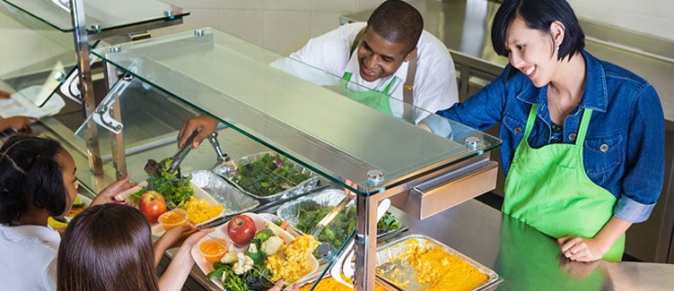
Participation (Are students choosing you?)
Why it matters
Participation is the heartbeat of program health. When more students eat school meals, you improve student outcomes and help ensure your program is financial sound. Participation also signals how well your menu, service model, and daily experience are landing with students. Just remember that participation can vary widely based on factors such as universal meals/CEP, menu popularity, free/reduced rates, etc.
What to measure
Average Daily Participation (ADP): This key metric represents the average number of students who participate in a specific meal program (like breakfast or lunch) each day over a set period of time. It plays an important role in helping to accurately forecast future demand and inform ordering, inventory management, food prep, staffing, menu planning, compliance, and even grant eligibility.
How to calculate:
- Total Reimbursable Meals Served ÷ Total Operating Days.
Example:
- Served 4,500 lunches
- 20 operating days in a month
- ADP is 4500 ÷ 20 = 225
Track this number over time to see if participation is trending up or down. Even measure how menu changes and other operation changes impact ADP (e.g. before and after).
Participation rate: Unlike ADP which is an actual number, participation rate looks at what percentage of the eligible student population (based on enrollment or average daily attendance) is eating reimbursable meals. This is a great way to better understand what level of participation your program is receiving.
How to calculate:
- Based on enrollment
- Total reimbursable meals ÷ (Enrollment × Operating days) × 100%
- Based on average daily attendance (ADA)
- Total reimbursable meals ÷ (ADA × Operating days) × 100%
Example:
- Enrollment = 500
- Serving days in month = 20
- Total reimbursable lunches: 3,800
- Participation rate (Enrollment) = 3,800 ÷ (500 × 20) = 38%
Menu & item popularity (What do students actually want?)
Why it matters
Students return for items they love and a menu that feels familiar but not boring. Popularity data helps you identify proven winners, fix underperformers, and market better at the line.
What to measure
Reimbursable meals sold by entree: Tracking this metric helps to understand what types of reimbursable meals and/or entrees are most popular. Like any business, the more popular the item, the more sales you’ll generate which drives revenue for your program.
To track this, pull a sales report that shows the number of meals sold each day and meal period. Depending on how your POS is set up, you may also need to pull a secondary item sales report to see different types of reimbursable meals sold (e.g. grab-and-go salad meal, deli meal).
Then, overlay this information with your menu to determine what entrees or meals are most popular. While you can’t necessarily serve pizza every day of the week, you might be able to swap out low-performing entrees for something more desirable that still meets your menu requirements.
Once you make the swap, track sales for that particular item over a period of time to see if sales are trending upward.
Top & bottom 10 a la carte items by sales: A la carte items can also provide a much needed revenue boost to your nutrition program by capturing sales from students that might otherwise not have purchased anything.
Pull a detailed item sales report for a longer period of time (e.g. full month) and see what items are selling the most and which ones are not. For low performing items, consider swapping them out for ones that you believe may drive more sales.
After making the swap, track sales over a period of time to see if sales are trending upward.
Pro Tip: Not sure what new entrees or ala carte items are going to sell best? Don’t just guess. Ask your food distributor what items are flying off their shelves. Ask neighboring districts what’s working for them. And, most importantly, ask your students what they would purchase if it was offered. You can survey them or have them vote for what new item they would like to see next on the menu.
Serving line performance (How quick can students get through the line?)
Why it matters
Even great menus won’t overcome long lines. The line is your storefront: if it’s slow or confusing, students opt out. Small performance tweaks can translate into additional meals sold each week.
What to measure
Transactions per minute (TPM): This is a great way to get a pulse on what lines are seeing high traffic and how quickly your cashiers are able to get students checked out.
How to calculate:
Export a detailed transaction report to CSV or XLS file format that can be easily opened in Excel or Google Sheets. Make sure it includes a time stamp and sort it so all the transactions are in chronological order. Then count how many transactions (rows in the spreadsheet) there are per minute.
Take a few measurements each day and average them. Then, randomly select a few days/weeks for the same meal period and average them again. This will give you a baseline TPM number you can start from to see if it trends up or down over time.
Example:
- Line 1 - Monday (Lunch) = 8 transactions/min
- Line 1 - Wednesday (Lunch) = 5 transactions/min
- Line 1 - Friday (Lunch) = 4 transactions/min
- (8 + 5 + 4) ÷ 3 = 5.7 transactions/min
4-6 TPM (10-15 seconds per student) is a good, achievable goal for most schools that have efficient processes in place. However, be careful when comparing this across multiple sites or lines. Factors such as line configuration and serving complexity can have wide ranging effects on this metric.
Average wait time & line abandonment: If you are seeing issues with line speed (e.g. TPM) or participation is trending downward, these metrics can provide additional context to help you understand if there truly are issues with serving line performance.
Where do you find them? Likely not in your POS. Instead, it involves some good old-fashioned visual observations. Have a staff member grab a stopwatch and time how long it takes for each student to get through the line during peak serving time. Average them out to get your average wait time number. Additionally, keep track of students who enter the line and then walk away without making a purchase (if this is an identifiable problem).
While your team member is there, have them note any potential issues that might help address the slowness. It could be that your cashier is having challenges getting students checked out, students might not be prepared to scan their id or enter their pin number when they get to the front of the line. Or, the issue could be further back in the line. Maybe it’s taking too long to plate food items or students are confused about what’s on the menu.
Once you’ve identified what lines are underperforming and you document some of the challenges, you can start to address them and make adjustments.
Pro Tip: Here’s just some of the adjustments you can make to help improve line speed. For your POS terminals, standardize the placement and naming of each button to make it easier for staff to find them, add a second pin pad (one on each side of your terminal) or move your current pin pad back further so students are queued up earlier. At the back of the line, add clear signage so students know which line to enter and what is being offered.
Labor cost and staff (Are people scheduled and used where they matter most?)
Why it matters
Controlling labor cost is all about putting people in the right place at the right time to maximize revenue and keep your operation running smoothly. Overstaffing can quickly inflate labor costs without much benefit. Conversely, understaffing can create serving bottlenecks and depress participation.
What to measure
Meals per labor hour (MPLH): This is one of the most popular, industry-standard, ways to determine how efficient and productive your nutrition program is.
How to calculate:
- Total number of meals or meal equivalents (e.g. snack meals) served ÷ total number of paid labor hours for a specific period of time.
Example (One week using Meal Equivalents):
Weekly counts:
- Reimbursable lunches: 2,000 → MEQ factor 1.00 = 2,000
- Reimbursable breakfasts: 1,200 → MEQ factor 0.67 = 804
- Snacks: 400 → MEQ factor 0.50 = 200
- Adult meals: 80 → MEQ factor 1.00 = 80
- A la carte revenue: $1,800; base paid lunch price: $3.50 → A la carte MEQ = 1,800 ÷ 3.50 = 514
- Total Meal Equivalents = 2,000 + 804 + 200 + 80 + 514 = 3,598
Weekly labor hours (paid/worked on production, service, dish, on-site admin):
- Site staff total = 360.0 hours
- MPLH = 3,598 ÷ 360.0 = 10.0 meals per labor hour
Generally speaking, the higher the number the more efficient and productive your program is. However, it’s important to note that MPLH can vary across sites. School kitchens that serve less processed foods typically require more labor to produce which can lower your MPLH. Conversely, kitchens serving more processed foods will require less labor and could result in a higher MPLH.
Additionally, Meal Equivalents (MEQs can vary from district to district). Check with your state to see if a standard already exists. Once decided, keep them consistent to ensure clean reporting.
Revenue per labor hour (RPLH): When MPLH is paired with RPLH is help provide a fuller picture of your program's performance and how well it is managing labor cost. RPLH shows how much income your program generates for each hour of labor.
How to calculate:
- Total Program Revenue ÷ Total Labor Hours (for the same period).
Pull a sales or revenue report from your POS and a labor report from your time management program to get these two numbers.
Example:
Revenue:
- NSLP + SBP reimbursements (accrued from meal counts): $15,200
- Paid student meals: $3,600
- Adult meals: $400
- A la carte: $2,300
- Total revenue = $21,500
Labor hours:
- Site staff paid hours (+OT): 360.0
- RPLH = $21,500 ÷ 360.0 = $59.72 per labor hour
Food waste (What’s left on trays—and why?)
Why it matters
When food gets tossed at the end of the day, it ultimately results in lost revenue for your program. While there will always be some percentage of waste that's accepted as a cost-of-doing business, it's a key area that should be closely monitored.
What to measure
There's a multitude of ways to track food waste. However, one that is often overlooked is analyzing your item-level sales report. The key to tracking this, starts with making sure your POS is tracking meal sales at the component level.
For instance, instead of a cashier hitting a button called "Reimbursable Meal", they would look at the student's tray and key in each individual item (e.g. Burger, Fries, Carrots, Milk). When all the items are keyed in your POS would track the sale of all the individual items and count it as a single reimbursable meal.
Then, using an item sales report, you can see exactly how many carrots were sold. Multiple that by the portion size and subtract that total from your production count to determine your waste. No more guessing or estimating food waste!
The only trade-off is that tracking reimbursable meals with this level of granularity can take longer to key in resulting in slower lines. If food waste is a more significant concern than line speed or participation levels, this option may be worth considering.
Start small, learn fast
Pick one site and one lunch period. Pick one or two metrics to track first and do the calculations to establish a baseline. Then choose one you believe you can improve on and make your change (e.g. add a second pin pad, post better signage, swap out a menu item). Track the impact for two to four weeks. If you improve participation by even 5% and cut two minutes off the peak wait, you’ll feel it in both student satisfaction and your bottom line.